Skip to content
SproutAceve · v3.22.0
Get started
Overview What is your role? Connect to Sprout Adopting Sprout
Foundations
Brand & logos Color Typography Spacing & layout Elevation Iconography Accessibility
Components
Overview Buttons Inputs & forms Numeric input Data grid Ribbon toolbar Navigation Cards Alert Avatar Badge Dialog Tabs Floating tabs Menu
Practice
Interaction & motion Voice & content Product patterns
Artificial Intelligence
AI patterns AI transparency & disclosure AI disclosure label
People & ethics
Design principles Personas Trust and ethics Meet the makers
Playground
Build the systemplay Tower of tokensplay
Behind the system
How it works Changelogv3.22 Roadmap Contribute
Draft
Foundations

Brand & logos.

Aceve is the parent brand across all products. Each logo comes in multiple colour variants — switch between them below, then copy the SVG directly or download SVG and PNG files. A "Download all" button grabs every variant in one go.

Our Logotype

Our logotype is our primary brandmark and consists of two elements: the symbol and the wordmark.

The symbol and wordmark can be used together in the approved logotype configuration, or individually when the application calls for it — for example, using the symbol as a compact brand signature.

Always use the provided brand assets and approved configurations. Do not rearrange, recreate, or combine the symbol and wordmark to create new versions of the logotype.

Aceve logotype

The full wordmark in 7 colour variants. Use green on white for primary placements; white on dark for reversed layouts.

Aceve logotype — Green
SVG

Aceve symbol

The standalone mark — 7 colours. Reserve for app icons, favicons, and situations where the wordmark would be too wide.

Aceve symbol — Green
SVG

Aceve symbol — boxed

Four contained variants for app tiles, social avatars, and partner co-branding.

Aceve symbol boxed — Pale on green
SVG

How to use the logotypes

Our logotype is a key part of the Aceve identity and helps make our brand recognizable and consistent. Use it with care and follow these guidelines to ensure it always appears clearly and confidently across every touchpoint.

The following guidance covers the available logotype variations, when to use them, and how to apply them correctly.

Aceve Visual Guidelines
Chapter 2: Brandmarks · Version 2.0 · 2025
The guide covers Colors · Clearspace · Placement

Logotype — do’s and don’ts

Keep the approved lockup intact.

Do
  • Use the approved logotype whenever both the symbol and wordmark should be visible.
  • Use the symbol or wordmark individually when appropriate for the format and context.
  • Use the official brand assets provided in the design system.
  • Keep the proportions and relationship between the symbol and wordmark intact.
Don’t
  • Don’t rearrange the symbol and wordmark.
  • Don’t change the proportions or spacing of the logotype.
  • Don’t create new lockups or configurations.
  • Don’t recreate or typeset the wordmark yourself.
  • Don’t add other elements to the logotype.

Primary colors

Our primary brandmark colors are Deep Green and Pale Green.

These are the preferred combinations and should be used for most everyday brand applications.

The same color principles apply when the wordmark and symbol are used individually. Always choose the variation that provides sufficient contrast and keeps the brandmark clearly visible.


Use Deep Green on light backgrounds.
Use Pale Green on dark backgrounds.
Do
  • Use Deep Green on light surfaces and Pale Green on dark surfaces.
  • Prioritize the primary color combinations whenever possible.
  • Make sure the brandmark has strong contrast with its background.
  • Apply the same color rules to the logotype, wordmark, and symbol.
Don’t
  • Don’t use a brandmark color that has insufficient contrast with the background.
  • Don’t introduce unapproved colors.
  • Don’t apply gradients or effects to the brandmark.
  • Don’t modify the colors of individual parts of the logotype.

Secondary colors

Additional approved brandmark colors, for when the context requires greater flexibility.

Black and white versions are intended primarily for internal documentation, or situations where color reproduction is unavailable or unsuitable — such as monochrome office printing.

Green, Mint Green and Light Green variants can be used in more expressive communication, including social media, film, campaigns, and digital applications.


Black
Black
White
White
Mint Green
Mint Green
Light Green
Light Green

Primary brandmark colors should remain the default. Use secondary colors intentionally rather than simply for visual variation.

The same rules apply when using the symbol or wordmark individually.

Do
  • Use black or white when color reproduction is unavailable.
  • Use approved secondary greens for expressive or communication-led applications.
  • Use primary colors by default and secondary colors when there is a clear purpose.
Don’t
  • Don’t treat secondary colors as replacements for the primary colors.
  • Don’t choose brandmark colors solely for decoration.
  • Don’t create additional color variants.
  • Don’t use colors outside the approved brand palette.
  • Don’t sacrifice legibility or contrast for color expression.

Clearspace

Clearspace protects the visibility and integrity of our brandmarks.

No text, imagery, graphics, interface elements, or other visual content should enter the defined clearspace around the logotype or symbol.

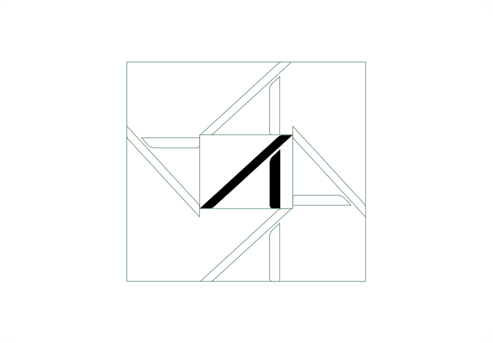
The minimum clearspace is equal to the x-height of the symbol. This measurement scales proportionally with the brandmark, so the same rule applies at every size.

Treat this as the minimum required space. More space can be used whenever the layout allows.
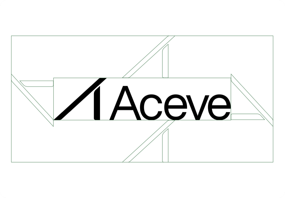
Clearspace around the full logotype.
Clearspace around the standalone symbol.
Do
  • Maintain at least the minimum clearspace around every brandmark.
  • Scale the clearspace proportionally with the brandmark.
  • Give the brandmark additional space when the composition allows.
  • Consider nearby text, images, interface elements, and artboard edges when checking clearspace.
Don’t
  • Don’t place text or graphics inside the clearspace.
  • Don’t crop other elements into the clearspace.
  • Don’t reduce the clearspace at smaller sizes.
  • Don’t treat clearspace as optional in compact layouts.

Logotype placement

Consistent placement makes our brand easier to recognize across different formats and channels.

The preferred placement for the logotype is in a corner of the artboard, with corner placement taking priority. The logotype may also be centered when the composition calls for a stronger, more deliberate brand presence.

Choose placement according to the format, orientation, hierarchy, and visual weight of the design. Avoid arbitrary placement that has no relationship to the composition.

Placement priority
  1. Primary: Place the logotype in an upper or lower corner.
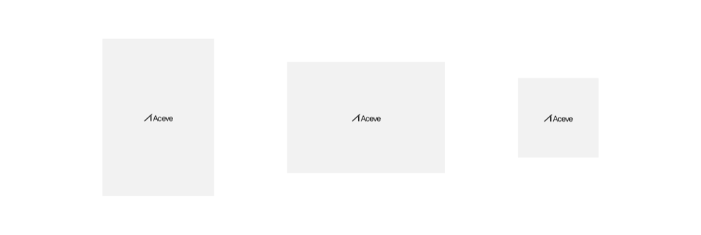
  2. Secondary: Center the logotype on the artboard.
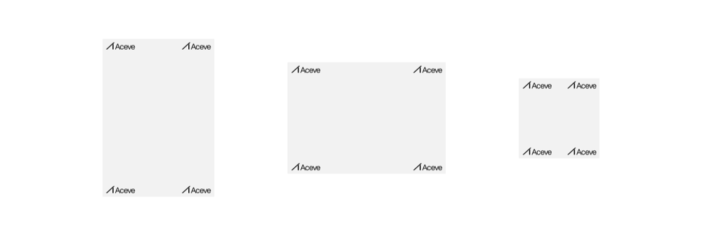
Primary — corner placement, across portrait, landscape and square formats.
Secondary — centered placement.
Do
  • Prioritize corner placement.
  • Use centered placement when it supports the composition.
  • Keep placement consistent across related assets.
  • Consider clearspace and margins when positioning the logotype.
  • Align the logotype intentionally with the layout.
Don’t
  • Don’t place the logotype arbitrarily within the composition.
  • Don’t position it at an unintended angle.
  • Don’t ignore the layout grid or surrounding content.
  • Don’t place it too close to the edge of the artboard.
  • Don’t compromise clearspace to make the logotype fit.
  • Don’t distort, rotate, crop, or alter the symbol to make it fit.

Symbol placement

The symbol offers more flexibility than the full logotype and can be used as a compact brand signature.

The preferred placement is in an upper or lower corner of the artboard. When the symbol is used at a larger scale as a prominent graphic or brand element, it may also be centered.

Placement should always feel intentional and relate to the structure of the composition.

Placement priority
  1. Primary: Place the symbol in an upper or lower corner.
  2. Secondary: When used at a larger scale, center the symbol on the artboard.

Primary — corner placement.
Secondary — centered, at a larger scale.
Do
  • Use corner placement as the default.
  • Center the symbol when it is large enough to become a primary visual element.
  • Maintain the required clearspace.
  • Align the symbol with the underlying layout or grid.
  • Keep placement consistent across related applications.
Don’t
  • Don’t center a small symbol without a compositional reason.
  • Don’t place the symbol arbitrarily.
  • Don’t use inconsistent positioning across a series of related assets.
  • Don’t place the symbol too close to other elements or artboard edges.
← PreviousAdopting SproutNext →Color
Sprout · Aceve Design System · v3.22.0
Figma library GitLabReleases