Iconography.
Sprout blends Lineicons Pro (Aceve has a perpetual license) with custom Aceve icons — available in both outlined and solid (filled) styles. All icons are drawn at 24×24 with currentColor so they inherit any text colour automatically. Click any tile to copy.
Adding an icon
New icon or tweaking an existing one? Here's the full path from Figma to production.
Shortcut for Lineicons icons: If the icon you need already exists in Lineicons Pro, ask a maintainer to add it to the curated set — no Figma editing required. Search the full Lineicons catalogue and drop the name in the Slack thread.
Install Lineicons
One library, three ways to ship it. Pick the integration that fits your stack.
# install
npm install lineicons-react

# use
import { LiHouse, LiSearch, LiBell } from "lineicons-react";

<LiHouse size={20} />
<LiSearch size={20} className="text-ink-2" />
Tree-shakable per-icon imports. Renders inline SVG so currentColor,size, and any className flow through unchanged.
<!-- in <head> -->
<link rel="stylesheet"
  href="https://cdn.lineicons.com/5.0/lineicons.css">

<!-- in markup -->
<i class="lni lni-home"></i>
<i class="lni lni-search"></i>
Sized via font-size, coloured via color. Use only when you can't pull in a JS bundle.
# clone or download
git clone https://github.com/LineiconsHQ/free-icons

# pick the file you need from /svg
free-icons/svg/home-2.svg
free-icons/svg/search.svg
Drop the SVG into your design tool or paste it inline. Stroke is alreadycurrentColor so it inherits Aceve ink colours automatically.
Icon styles
How to use our different functional icon styles:
- Outlined — buttons, illustrative, show functions
- Solid — mapping (where you are / something in use)
Icon size
Icons are sized relative to the surrounding text — set font-size on the icon element or a parent to resize.
14pxDense UI — data tables, chips, secondary metadata16pxDefault inline use — body text, form labels18pxSidebar navigation, section headers20pxCard actions, primary labels24pxCanonical size — standalone or hero contextsIcons in context
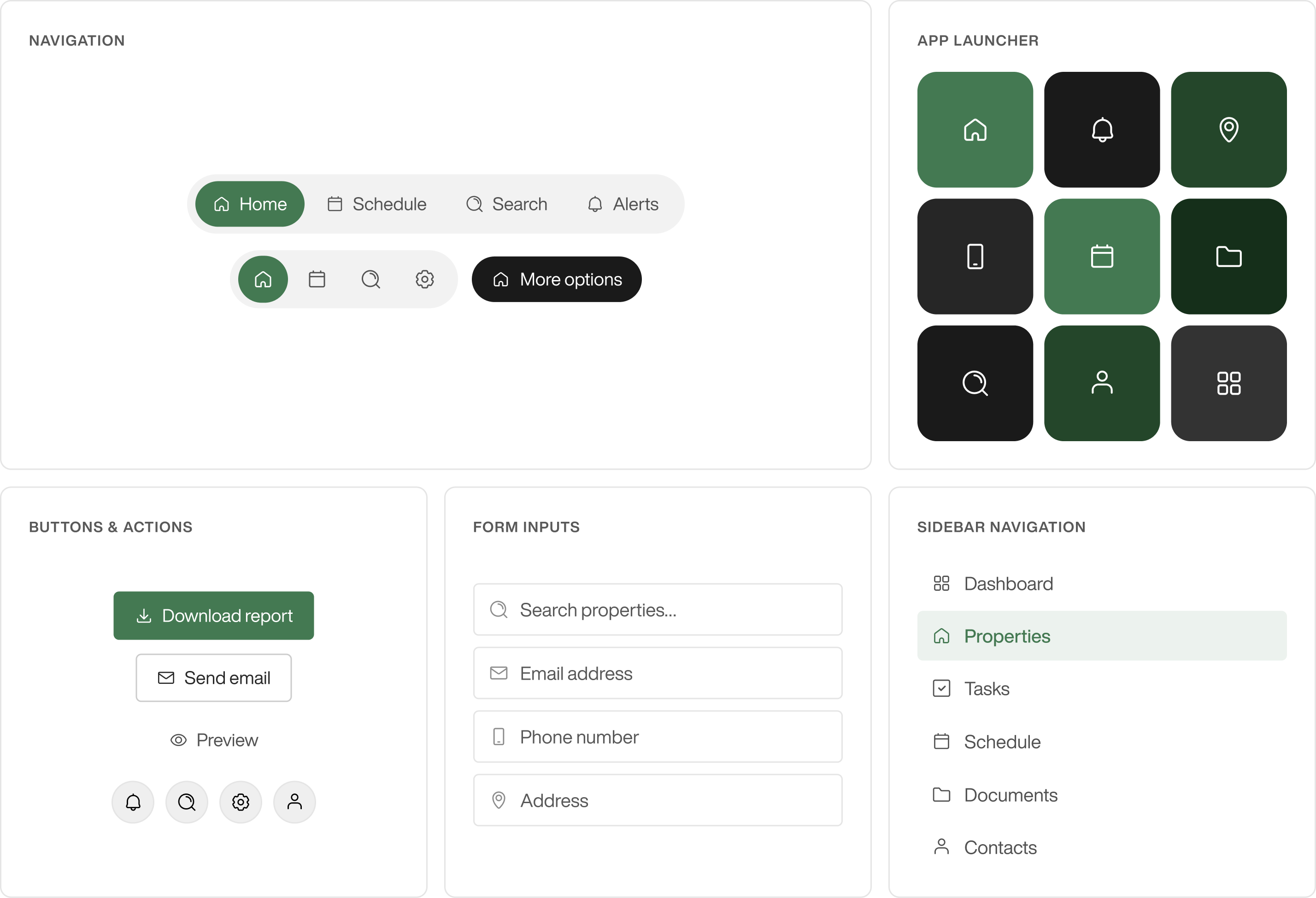
Want to see more? Select the button below to explore additional examples of how icons are used in context, including common patterns, placements, and combinations across the interface.
Usage — do's and don'ts
Common mistakes and patterns to follow when using icons in Aceve products.
Custom icons — drawing rules
Match these when adding a custom icon that has to live alongside Lineicons.