Typography.
One typeface runs the whole product — body copy, buttons, headlines, and the marketing surfaces that live inside it. Arial exists only because PowerPoint does.
Typefaces
Sprout runs on Manrope end to end, at every size from a 12px table cell to a 48px hero. The only other face in play is Arial, and only because every machine already has it installed for Office documents.
Manrope
Product · seven sizes: 12 · 14 · 16 · 20 · 24 · 36 · 48 · no other value is legal
Our product typeface. A geometric sans with generous counters and tight vertical metrics — legible at 12px in a dense table, and still comfortable at 48px. Used for every surface, product and marketing alike.
Free and open. Manrope is served from Google Fonts under the SIL Open Font License — no licence to buy, nothing to request, and it renders the same on every device the product runs on. That is the whole reason it carries every surface, brand included.
One ladder, four roles. The size tells you nothing on its own — the role decides which token you reach for, and two roles share a size on purpose. Letter-spacing is always 0 — Manrope is never tracked, at any size.
Reading the specs. Each card gives the size in px with its rem equivalent, then the line height in px with its rem equivalent — so
16px (1rem) / 24px (1.5rem)is a 1rem size on a 1.5rem line height. Parentheses always mean rem. Build against these numbers, not against variable names: the CSS variables came from Shoelace, which is now Web Awesome, so the names may be renamed out from under us. The values are the contract.
Weights
Three weights, and only three. Manrope ships seven — Light, Medium and ExtraBold are not part of Sprout and are not loaded, so they cannot be used by accident.
Manrope Display sizes
Use for: hero blocks, onboarding, campaign banners — the few places marketing type lives inside a product screen.
Use for: "What is this screen?" One per screen at most. Also carries big numbers and metric values.
Use for: "What is this thing?" It names something — a widget, a card, an order, a section.
Use for: "What is this value?" It annotates something else. Never a sentence.
Use for: "What does it say?" Prose meant to be read in sentences.
Use for: Interactive only. Text inside a real button or link — nothing else.
Use for: Form input placeholder text — muted, never used for real content.
Headline, Title, Label or Body?
The question people actually get stuck on. One sentence each.
Worked example
The trap. Title Small and Label Large are both 16 / 24 SemiBold 600 — visually identical. They are not interchangeable. Choose by role: a card title names the card, a label annotates a value inside it. Same pixels, different meaning, and the distinction is what keeps a redesign from breaking every screen at once.
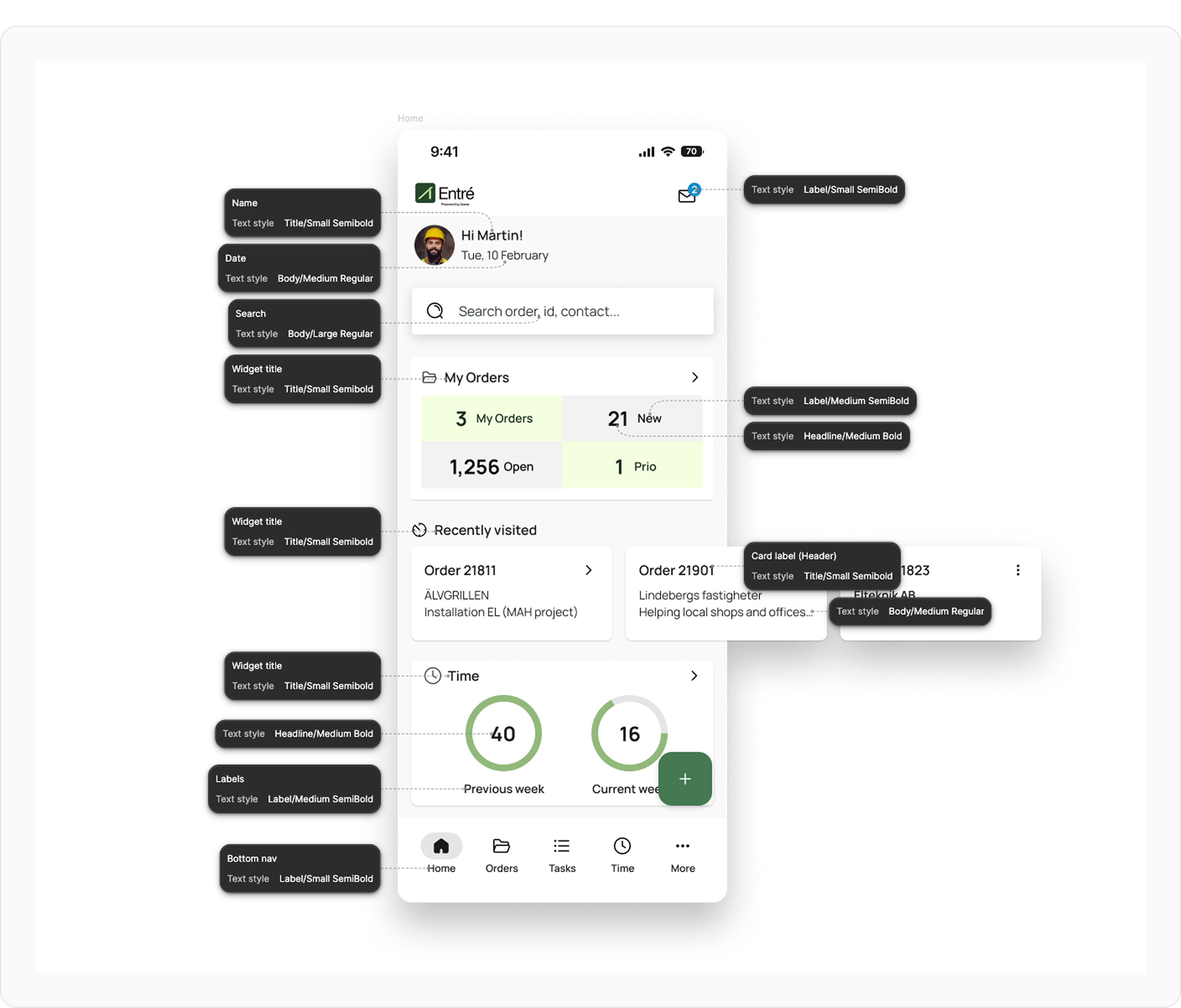
Entré home screen, with the text style called out on every element. A web example will follow.
Do & Don't
The three mistakes typography actually attracts in review.
Arial — the office typeface
The one exception, and only because Microsoft Office needs it.
For ease of use and to avoid compatibility issues, Arial is used for all MS Office software. It's the default typeface on both macOS and Windows, so a deck set in Arial survives being forwarded, opened on someone else's machine, and edited by someone who has never heard of the brand guidelines.